

See? I told you I’m on a drawing kick and this is certainly not the end of it. As I was working on this design, I thought I’d take some photos of various stages, so you can at least see a set of progress shots. There were steps I forgot to document because I was so busy trying to make it work, much like trying to shove one more thing into a packed suitcase.
For example here, you’d think I’d have taken a more clear cut ‘before’ picture, but no. You’ll have to take my word on it; there were random pencil sketches on various pieces of tracing paper in little clusters. I then hunkered down with a furrowed brow and started layering those pieces on top of each other to start merging my little city vignettes.
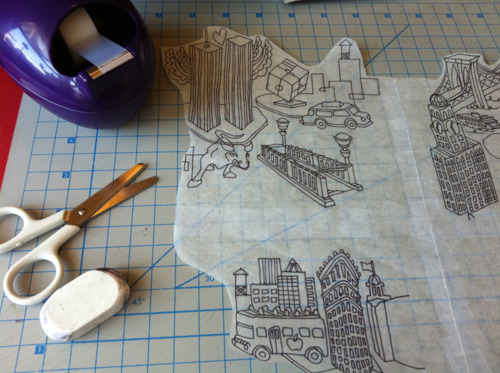
What you see above is the beginning of that inking process, just after I spliced my paper into quadrants and re-taped them to create my repeat. Btw, I’ve never bothered to do it this way before (I know, the madness of how I typically work might just be harder to explain, but I’ll leave that to another time). It was only after receiving Kim Kight’s AWESOME new book, A Field Guide to Fabric Design, for Christmas, that I got engrossed in trying her method for a hand-drawn repeat.
The hilarious and oh-so-typical-of-me part was that I wanted a half-brick repeat and somehow in my paper cutting and shuffling (all while entertaining Mister Baby Pants, who sat on my lap taking swipes at any tracing paper pieces that came close enough for him to grab at. Kid’s got a crazy good reach), I managed to do nothing but set up a straight repeat. I jumped right into drawing in the blank spaces and didn’t realize what I had done before it was too late. Ta-daa, error number one from that perfect design in my head. I decided to embrace it and carry on.
*Oh, and won’t you admire my new little tape dispenser (also a Christmas gift) in the upper left there? I love the design, although being left-handed I don’t quite get why it couldn’t have been more symmetrical for my I-pull-tape-off-the-roll-to-the-left dispensing. Grrrrr. *Shakes left fist in the air.* My little white Muji scissors don’t care which hand I use, however.
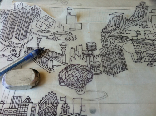
So here’s where I started penciling and then inking in the central blank area. Oh, I forgot to mention, this is my entry for a cityscape-themed design contest hosted by Spoonflower this week. Starting to recognize parts of it? 1964 World’s Fair, anyone?
If you look closely, you can see bits and pieces that are mis-inked. That’s how I roll. You know, not by choice, but I’ll clean it up after I scan it all.
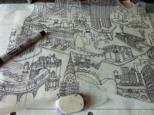
So then I cut the tape again and repositioned my quadrants to fill in some of the remaining areas. You can see I’m starting to mess up here. It’s inevitable, especially if I’m working long enough in one solid stretch. The Bub was at our favorite park with Dada on a lovely, unseasonably warm winter’s day, so I had plenty of time to work and was in the clear for him to not magically appear and add some festive crayon strokes to what I was working on. It was just Mister Baby Pants and his flailing arms acting as my resident saboteur. He did a fairly good job, I might add.
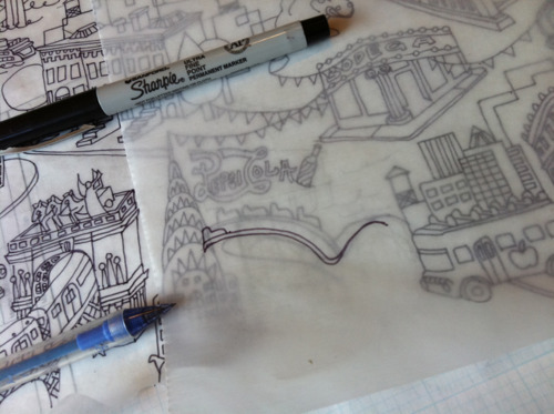
Annnnnd cue another error towards the end of my drawing session. That’s when they’re most liable to take place, you know, like tripping and knocking over a bewildered spectator right before the marathon finish line.
On the paper below you can see that I was filling in the empty space with that lovely vintage Pepsi Cola sign in Long Island City and beneath it, the Coney Island Cyclone wooden roller coaster. My sign managed to touch the Chrysler Building, which wasn’t supposed to happen, and then the roller coaster took on a life of its own (but don’t they always?) and it started to sprawl and take up too much space as well. I redrew what I really wanted on another overlapping piece of paper, knowing that I’d scan, clean up and cut-and-paste that into place. And I’d just shove over the Pepsi sign a smidgen to the right.
Are you still with me? I’m droning on, but there’s a chance you *might* be interested, yes?! 😀 We’re almost to the end…
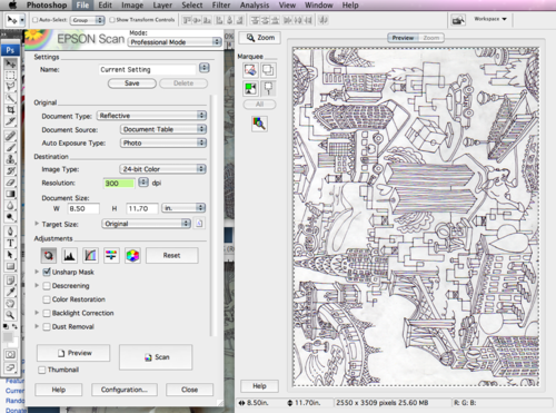
The final stage was closing up my pop-up drawing shop and moving operations over to the scanner and laptop. I scanned all bits and pieces in, realizing I should have worked on a slightly smaller sheet of paper that actually fit onto the scanning bed. Zut alors! Another unforeseen mini error. Hahaha, yes. Yes, of course there’d be another before the end.
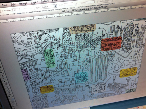
So after a bit more scanning and piecing together, I had what I wanted for the hand-drawn component of my design. Here’s where I really have no progress photos, as I was knee-deep in getting it done. I brought everything into Illustrator and made another layer where I created the color component of the design. Along the way, a myriad of ideas flooded my head about all the different ways I could apply color treatments that would work just as well as the next. Does this happen to you too? Many ways to present the final piece, but you simply just have to decide upon one and finish the darn thing!
So I tinkered and tinkered and got a result I’m really very happy with….
This isn’t the actual final file; I typically create .png files for upload, but you get the drift. Also the final colors are less saturated than they appear here. I’m really happy with it, even a few days after making it, which is saying a lot for my fickle self.
And there we have it! A choppy-in-places mini tour of how I created this personal tribute to New York City. I’ve entered it today into Spoonflower’s next contest. Voting opens this Thursday, so go check it out!
P.S. While we’re on the topic of cityscapes and the like, look at these intricate interpretations by Matthew Picton.