

When I’m thinking about a theme to morph into a textile pattern, I usually stick with my first idea. That’s often best because I can all too easily come up with multiple concepts or styles to illustrate a subject (a good and a bad thing sometimes).
Although only one of those ideas will typically see daylight, I do sometimes make multiple versions. Either because I think, “Ooooh, but what if I did it like this?!” or the first iteration just didn’t do it for me.
It’s all experimentation, and for me the process is a big part of designing. In that spirit, I thought I’d share a few recent designs because as of late, I seem to be into making multiple versions just to see what happens.
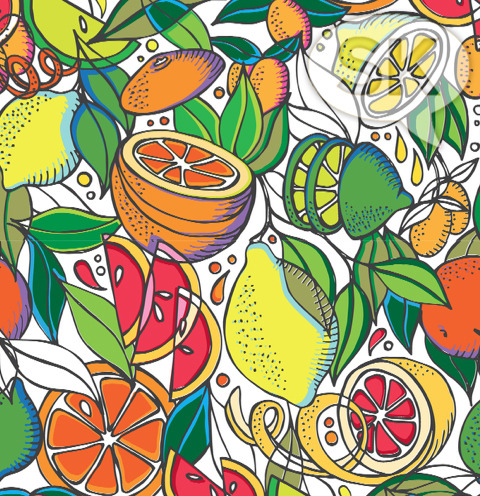
A recent theme of “citrus fruit” had me in a hand-drawing mood and I came up with this idea. I like how it’s colored and it’s perfectly nice, but somehow after a few days of looking at the finished pattern, it wasn’t interesting to me anymore (a chronic problem of mine).
I let it sit for a week or so and then promptly got a bee in my bonnet to revisit the theme again, but in a different way.
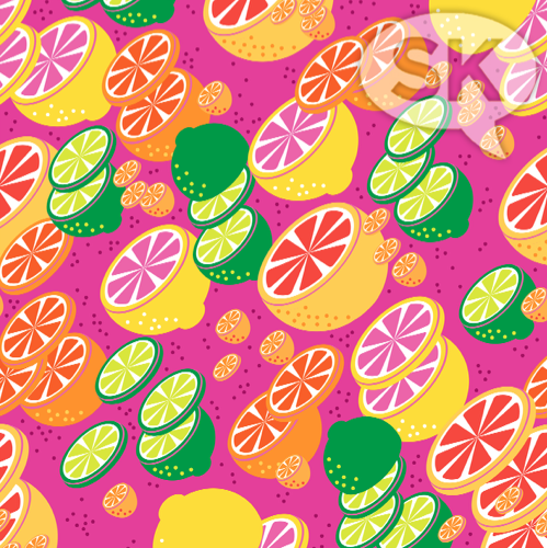
So I did this version. This was the one I finally went with, as I like the depth and movement it has. It also feels a bit like a Japanese kimono fabric design, maybe because the fruit segments seem sakura-like to me.
Anyway, after making this design, I felt good to move on to another theme.
But. Then. I went off the deep end a lil’ bit…
Sometimes I think it’s good to do a safe design and then push things further and further into unknown territory to see what happens.
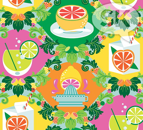
Here, there are elements I love and the overall idea is amusing to me – but – I also think it has a highly tacky Floridian retiree look to it. I can totally picture it covering some wicker veranda chairs that are then encased in protective plastic so overheated by the sun that the seats are too hot to sit in anyway.
Which, as I said, is somehow amusing to me.
It’s kinda ugly too. Hey look, I’m not beyond making ugly things…I just don’t usually allow them to see the light of day. You’re welcome.
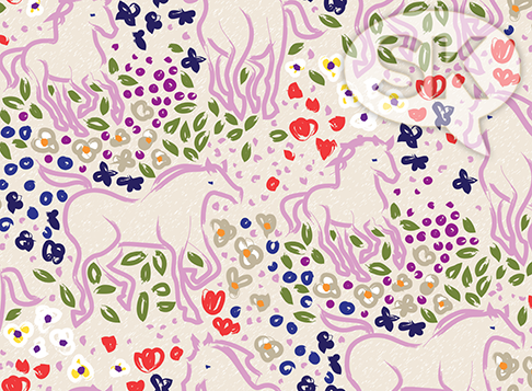
With a theme of “horses”, I began with wanting to try a style I don’t usually do to see if I could pull it off in an appealing way, so this is what I came up with. All drawn straight in Ai, it fulfills the look I was after and it’s pretty ‘n airy.
But, of course…
…in true SK form, a few days went by and I didn’t like it as much (here we go again) and wanted to go in a completely different direction.
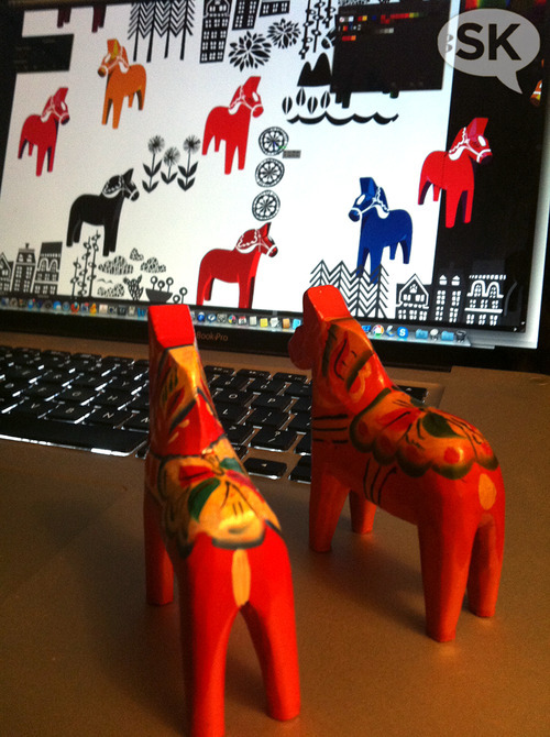
Channelling my love for all things Scandinavian, I grabbed two childhood bits of inspiration and got to work again late one evening.
This is the handy thing about having a 17" laptop that I can move around with me and attempt to take in some evening television (thus the moody living room lamp lighting above) while multi-tasking my face off in the process.
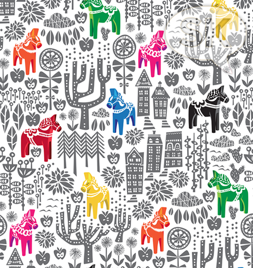
Annnnnd, here’s the result of my second wind of horse-centric designing. I can think of more approaches, but am very satisfied with this result for now.
Er, for now… 🙂